On This Page
What Is It?
Why Designers Need It
Key Benefits
How To Use
Frame Types
Color Combos
Popular Sizes
Use Cases
Common Mistakes
Pro Tips
Trending Styles
FAQs
What Is a Photo Frame Generator for Designers?
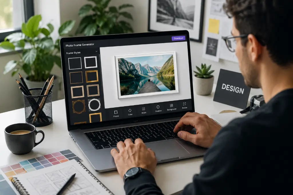
Imagine this: You're working on a branding project, and you need to showcase your client's product images with style. Instead of spending hours in Photoshop creating the perfect border, you simply upload your image to an online photo frame generator for graphic designers and voilà—instant professional frames.
A Photo Frame Generator for Designer is a specialized web-based tool that lets you add decorative borders, shadows, and stylistic elements to your images without needing advanced design software. Unlike regular photo editors that focus on filters and basic adjustments, these generators are built specifically for design professionals who need precise control over frame thickness, colors, and export quality.
How It Differs From Regular Photo Editors
Regular photo editors like basic mobile apps give you pre-set filters and simple borders. But when you're creating materials for client presentations or e-commerce platforms, you need more control. A professional photo frame generator offers:
- Transparent PNG export - Essential for overlaying frames on different backgrounds
- Pixel-perfect precision - Adjust frame width down to the exact pixel
- Brand consistency - Save your brand colors and apply them across multiple images
- High-resolution output - Print-ready files at 300 DPI or higher
Why Designers Need a Photo Frame Generator
Let's be real—designers wear multiple hats. You're not just creating; you're problem-solving, meeting deadlines, and ensuring every pixel serves a purpose. Here's where a free designer photo frame maker with transparent background becomes your secret weapon.
Real-World Use Cases That Matter
Social Media Graphics: Your client needs Instagram posts that stand out in a crowded feed. Adding a subtle shadow frame or a trendy glassmorphism border can increase engagement by up to 40%.
Product Mockups: Whether you're showcasing a new app interface or a physical product, frames add depth and professionalism. Think about how Apple presents their products—clean, framed, perfect.
Portfolio Presentations: First impressions matter. When potential clients browse your portfolio, well-framed images show attention to detail and elevate your entire presentation.
E-commerce Images: Amazon, Shopify, Etsy—platforms are competitive. Consistent framing across product images builds trust and makes your store look professional. Check out tools like auto-crop tools for ecommerce to complement your framing workflow.
Wedding Albums & Certificates: These require elegant, timeless frames. A gold-accented border or vintage-style frame can transform a simple photo into a cherished memory.
Benefits of Using an Online Photo Frame Generator
Here's why thousands of designers are ditching Photoshop for browser-based frame generators:
1. Saves Time (Like, A Lot)
What takes 15 minutes in Photoshop—creating layer styles, adjusting strokes, exporting—happens in 30 seconds online. That's time you can spend on actual creative work.
2. No Photoshop Required
Not everyone has access to Adobe Creative Cloud. Maybe you're a freelancer just starting out, or you work on a Chromebook. Browser-based tools level the playing field.
3. Transparent PNG Export
This is huge. You can overlay framed images on any background without that annoying white box. Perfect for overlaying images in complex designs.
4. Consistent Branding
Set your brand colors once, apply them to 50 images. Consistency builds recognition, and recognition builds trust.
5. High-Resolution Output
Print projects demand 300 DPI minimum. Good frame generators deliver print-ready files without compression artifacts.
6. Easy Customization
Sliders for thickness, color pickers, shadow controls—it's all visual and intuitive. No memorizing keyboard shortcuts.
How to Generate a Photo Frame (Step by Step)
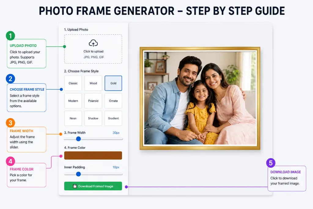
Ready to create stunning frames? Here's your foolproof workflow:
- Upload Your Image: Drag and drop or click to browse. Supports JPG, PNG, GIF—pretty much everything.
- Select Frame Style: Choose from classic, modern, gold, wood, polaroid, ornate, neon, shadow, or gradient. Each style serves different purposes.
- Adjust Frame Width: Use the slider to set thickness. For social media, 20-30px works great. For print, go 40-60px.
- Change Colors: Click the color picker. Want your brand's exact shade? Enter the hex code directly.
- Add Inner Padding: This creates breathing room between your image and the frame. 10-15px is the sweet spot.
- Preview in Real-Time: See changes instantly. No guesswork.
- Download: Click the download button. Choose PNG for transparency or JPG for smaller file sizes. If you need to resize image to exact size, do it after framing.
Best Types of Photo Frames for Designers
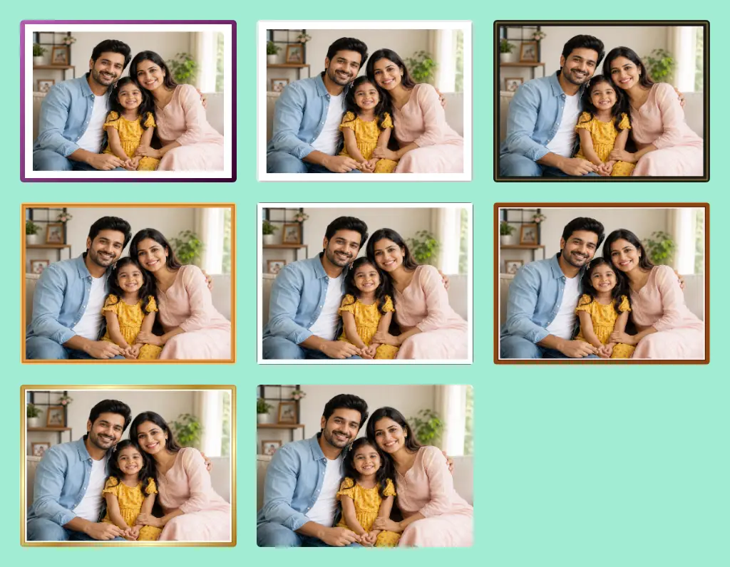
Not all frames are created equal. Here's when to use what:
Minimal Frame
Thin, clean borders (5-10px). Perfect for modern portfolios and minimalist branding. Less is more.
Modern Frame
Geometric, sharp edges with subtle shadows. Great for tech products and corporate presentations.
Vintage Frame
Ornate details, warm tones. Ideal for wedding photography, historical content, or luxury brands with heritage.
Luxury Frame
Gold or silver gradients with elegant spacing. Use sparingly for high-end products and premium services.
Polaroid Frame
That nostalgic white border with extra bottom space. Trending on Instagram and perfect for lifestyle brands.
Circle & Rounded Frames
Soft, approachable. Works beautifully for profile pictures and organic brands. Try our circle crop tool for perfect results.
Neon Frame
Glowing borders for edgy, youthful brands. Nightlife, gaming, music—this is your frame.
Glassmorphism Frame
The 2024 trend. Frosted glass effect with subtle transparency. Perfect for modern UI designs.
Best Color Combinations for Professional Frames
Color psychology matters. Here are designer-approved combinations:
- Black + Gold: Luxury, sophistication, premium products
- White + Gray: Clean, modern, tech-focused
- Navy + Silver: Professional, trustworthy, corporate
- Beige + Brown: Warm, organic, artisanal
- Purple + Pink: Creative, playful, youth-oriented
- Blue + White: Calm, reliable, healthcare/finance
- Green + Cream: Natural, eco-friendly, wellness
Pro tip: Use your brand's primary color for the frame and a complementary shade for shadows. This creates depth without clashing.
Photo Frame Sizes Designers Use Most
| Platform/Use | Dimensions (px) | Recommended Frame Width |
|---|---|---|
| Instagram Post | 1080 × 1080 | 20-30px |
| Instagram Story | 1080 × 1920 | 15-25px |
| Facebook Cover | 820 × 312 | 10-20px |
| LinkedIn Banner | 1584 × 396 | 15-25px |
| YouTube Thumbnail | 1280 × 720 | 20-30px |
| Pinterest Pin | 1000 × 1500 | 25-35px |
| Business Card | 1050 × 600 (300 DPI) | 40-50px |
| Poster (A4) | 2480 × 3508 (300 DPI) | 50-80px |
| Flyer | 2480 × 3508 (300 DPI) | 40-60px |
Where Designers Use Photo Frames
Beyond the obvious, here's where frames add value:
- Branding Materials: Letterheads, business cards, brochures
- UI/UX Design: App screenshots, feature highlights
- Web Design: Team photos, testimonials, case studies
- Certificates: Awards, completion certificates, diplomas
- Invitations: Weddings, corporate events, parties
- Menus: Restaurant food photography
- Magazine Layouts: Article headers, feature spreads
- Presentations: Pitch decks, annual reports
Common Design Mistakes to Avoid
Even pros slip up. Here's what to watch for:
1. Thick Borders Everywhere
A 100px frame on a mobile image? That's 50% of your real estate gone. Match frame width to image size.
2. Wrong Color Combinations
Red frame on green image = Christmas vibes (unless that's intentional). Check color harmony.
3. Low Resolution Exports
Always download at the highest quality. You can compress later using image compressor tools, but you can't add quality back.
4. Inconsistent Spacing
If one image has 10px padding and another has 30px, your grid looks amateurish. Create a style guide.
5. Too Many Decorative Elements
Ornate frames are beautiful, but not on every image. Mix simple and decorative for visual interest.
6. Poor Contrast
Light gray frame on white background = invisible. Ensure enough contrast for visibility.
Professional Design Tips
Level up your framing game with these insider techniques:
White Space Is Your Friend
Don't fear empty space. It draws attention to your subject. A 20px frame with 15px inner padding creates elegant breathing room.
Visual Hierarchy
Use thicker frames for hero images, thinner ones for supporting visuals. This guides the viewer's eye.
Color Psychology
Blue frames suggest trust (great for finance). Green implies growth (perfect for wellness). Match frame color to message.
Grid Alignment
When creating multiple framed images, use consistent dimensions. A 1080×1080 grid looks cohesive; mixed sizes look chaotic.
Typography Pairing
If your frame has text (like a polaroid date), ensure the font matches the frame style. Script fonts for vintage, sans-serif for modern.
Balance & Contrast
Dark images need lighter frames. Light images can handle darker borders. Create contrast without overwhelming.
Trending Frame Styles in 2024
Stay ahead of the curve with these emerging trends:
- Glassmorphism: Frosted glass effect with background blur. Apple and Microsoft are using this heavily.
- Minimalism: Ultra-thin 2-5px borders. Less noise, more focus.
- Soft Gradients: Subtle color transitions instead of solid borders. Feels modern and fresh.
- Clay Design: Soft, rounded corners with gentle shadows. Approachable and friendly.
- 3D Borders: Frames that appear to pop off the screen. Great for product showcases.
- Neon Glow: Cyberpunk aesthetic with glowing edges. Perfect for gaming and nightlife.
- Abstract Frames: Irregular shapes, organic curves. Breaks the rectangle mold.
- Organic Shapes: Wavy borders, hand-drawn feel. Adds personality and warmth.
Free vs Premium Frame Generators
Should you pay? Here's the breakdown:
Free Tools (Like Ours!)
Pros: No cost, instant access, no watermarks, transparent PNG export, decent customization. Perfect for freelancers and small projects.
Cons: Limited advanced features, fewer frame styles, no batch processing.
Premium Tools
Pros: Advanced effects, batch processing, cloud storage, team collaboration, priority support.
Cons: Monthly fees ($10-30), overkill for occasional use.
Verdict: Start with free tools like our professional image editor without watermark. Upgrade only if you need batch processing or advanced features.
Frequently Asked Questions
Start by uploading your image to a photo frame generator. Select your preferred frame style (classic, modern, gold, etc.), then adjust the frame width using the slider. Use the color picker to match your brand's exact hex code. Add inner padding for breathing room, preview your changes in real-time, and download as PNG for transparency. For consistent branding across multiple images, save your color settings and apply them uniformly.
Absolutely! Most professional photo frame generators allow you to export as PNG with transparent backgrounds. This is essential for overlaying framed images on different backgrounds in your designs. Simply download your framed image as PNG format, and the frame will have transparency around it, making it perfect for overlaying on other images or colored backgrounds.
For branding mockups, minimal or modern frames work best. They add professionalism without distracting from your brand elements. Use thin borders (10-20px) in your brand colors. If you're showcasing luxury products, consider gold or gradient frames. For tech brands, stick to clean, geometric frames with subtle shadows. Consistency is key—use the same frame style across all mockups.
Yes! Just ensure you download at high resolution (300 DPI minimum for print). Most online frame generators provide print-ready files. For best results, use frame widths of 40-80px for print materials, and always download as PNG or high-quality JPG. Check that your color mode is suitable for print (CMYK is ideal, though many online tools use RGB which is acceptable for most print services).
For web use, PNG is best if you need transparency (like when overlaying on different backgrounds). JPG is better for photographs and results in smaller file sizes, which improves page load speed. If file size is a concern, you can always use an image compressor after downloading to optimize without visible quality loss.
Definitely! That's the beauty of online photo frame generators. They're designed for everyone, from professional designers to complete beginners. The drag-and-drop interface, visual sliders, and real-time preview mean you don't need any design software knowledge. If you can use a smartphone app, you can create professional frames online.
For print, always use 300 DPI (dots per inch) minimum. This ensures crisp, clear output without pixelation. When creating frames for print materials like business cards, posters, or flyers, start with high-resolution images and maintain that quality throughout. Most online generators preserve the original image resolution, but always verify before downloading.
Create a style guide document noting your exact settings: frame width (e.g., 25px), color hex codes (#0e98ba), inner padding (e.g., 12px), and chosen frame style. Apply these exact settings to every image. Some advanced tools allow you to save presets, but even manually noting your settings ensures consistency. This is crucial for professional branding and portfolio presentations.
Reputable online tools are perfectly safe for client work. They process images in your browser without uploading to servers, ensuring privacy. Look for tools that explicitly state no watermarks, no registration required, and secure processing. Always review the privacy policy, and for highly sensitive client work, consider offline software or premium tools with enhanced security features.
Yes! Most professional frame generators offer shadow controls where you can adjust shadow blur, offset, and opacity. Some advanced tools also provide effects like neon glow, gradient overlays, and glassmorphism. These effects add depth and dimension to your frames, making images pop. Experiment with subtle shadows (5-10px blur) for a professional look.
Not necessarily. Many excellent tools, including ours, work without registration. You can upload, customize, and download immediately. However, premium tools or those offering cloud storage and preset saving may require an account. For quick, one-off projects, no-signup tools are perfect. For ongoing work with saved settings, consider creating a free account.
Frame width is the thickness of the visible border around your image—this is the colored or styled part. Inner padding (also called mat or margin) is the space between your image and the frame edge, usually in white or neutral color. Think of it like a museum frame: the frame width is the wooden border, and the padding is the white mat that separates the artwork from the frame.
Most free online tools process one image at a time. However, premium tools and desktop software offer batch processing where you can apply the same frame settings to dozens of images simultaneously. For free alternatives, some designers use browser automation or create templates in tools like Canva. If you need frequent batch processing, it might be worth investing in a premium solution.
Use color theory and contrast principles. For vibrant images, neutral frames (white, black, gray) work best. For muted images, try complementary colors to add interest. Always ensure sufficient contrast between the frame and the image edge. Use your brand colors for consistency, or sample a dominant color from the image itself using an image palette generator.
Always crop first, then frame. Cropping determines your composition and aspect ratio. Adding a frame afterward enhances that composition. If you frame first, then crop, you might lose part of your frame or create uneven borders. The workflow should be: crop → adjust → enhance → frame → export. This ensures precise control over both composition and presentation.
Yes, absolutely! Frames you create are yours to use commercially. However, ensure the original image you're framing is either yours, licensed for commercial use, or royalty-free. The frame itself adds no copyright restrictions. Just be mindful of any stock photo licenses if you're using third-party images.
For social media, 15-30px frame width works best. Instagram posts look great with 20-25px frames. Stories can handle slightly thinner frames (15-20px) since vertical space is limited. Facebook and LinkedIn benefit from 20-30px. Remember, mobile screens are small—thick frames eat up valuable real estate. Always preview on mobile before posting.
Use a free background remover tool before framing. This creates a transparent PNG that you can then frame. The combination of background removal and custom framing gives you maximum flexibility—your framed subject can sit on any background in your final design. This is especially useful for product photography and portrait work.
Some advanced frame generators offer preset saving, but many free tools don't. A workaround is to screenshot your settings or note them down (frame width: 25px, color: #0e98ba, padding: 12px). Premium tools often include cloud storage for your presets. For frequent users, this time-saving feature might justify upgrading to a paid plan.
Pixelation usually means the original image resolution is too low for your intended use. Always start with high-resolution images (at least 1080px on the shortest side for web, 3000px for print). If your source image is small, try an image enhancer to upscale before framing. Also, ensure you're downloading at the highest quality setting available.