Best Image Size for Website: The Complete Guide to Faster Loading & Better SEO
Learn exactly how to choose the right image dimensions, file size, and format for every type of website image—while keeping your pages fast, responsive, and SEO-friendly.
On This Page
Let's cut straight to the chase: there's no single "best image size for website" that works for every situation. But don't worry—that's actually good news. Once you understand the principles behind image optimization, you'll be able to make smart decisions for any type of image on your site.
The ideal image size depends entirely on where that image lives on your website and what job it needs to do. A hero banner that spans the full width of a desktop screen needs completely different dimensions than a small product thumbnail or a blog post featured image.
Here's what really matters: getting the balance right between image quality and file size. You want your images to look crisp and professional, but you also need your pages to load quickly—especially on mobile devices where patience runs thin and data plans aren't unlimited.
What Is the Best Image Size for a Website?
When people ask about the best image size for website use, they're usually mixing up two different concepts: image dimensions (the width and height in pixels) and file size (how many kilobytes or megabytes the image takes up). Both matter, but for different reasons.
Think of image dimensions like the physical size of a photograph—how wide and tall it is. File size is more like the weight of that photograph—how much digital space it occupies. You can have a huge dimensional image that's been compressed to a small file size, or a small dimensional image that's uncompressed and surprisingly heavy.
Image Dimensions (Pixels)
This is the actual width and height of your image. For example, 1920 × 1080 pixels means the image is 1920 pixels wide and 1080 pixels tall. This determines how large the image can display without becoming pixelated or blurry.
File Size (KB/MB)
This is how much storage space the image file requires. A 2 MB image will take longer to load than a 200 KB image. File size is controlled by compression, format choice, and the complexity of the image itself.
The recommended image size for website performance really comes down to this: serve images that are just large enough to look sharp at their display size, but no larger. There's no point in uploading a 4000-pixel-wide photo if it's only going to display at 800 pixels wide on your blog post.
Best Image Dimensions for Different Website Images
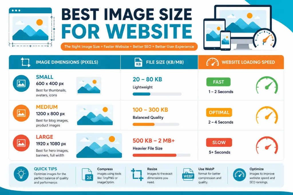
Different parts of your website have different image needs. Let's break down the ideal image size for website elements so you know exactly what to aim for:
| Image Type | Recommended Dimensions | When to Use |
|---|---|---|
| Hero/Banner Images | 1600-1920 px wide × 600-1080 px tall | Full-width header images, landing page banners |
| Blog Post Featured Images | 1200 × 630 px | Social sharing, blog headers, article previews |
| Blog Content Images | 1200 px wide (height flexible) | Images within blog posts and articles |
| Product Images | 1000-1500 px wide × 1000-1500 px tall | E-commerce product photos, galleries |
| Thumbnails | 300-600 px wide | Image grids, related posts, small previews |
| Logo Images | SVG format preferred, or 250-400 px wide | Site headers, footers, branding |
| Background Images | 1920 × 1080 px minimum | Full-screen backgrounds, parallax effects |
| Social Sharing Images | 1200 × 630 px (Open Graph) | Facebook, LinkedIn, Twitter cards |
These dimensions are starting points, not rigid rules. Your specific best image size for website needs will depend on your theme, layout, and design choices. The key is to measure where your images will actually display and size them accordingly.
Why These Specific Dimensions?
Most modern websites have content areas that max out around 1200 pixels wide. That's why 1200 pixels is a sweet spot for blog images—it's wide enough to look sharp on large screens but not so huge that you're wasting bandwidth.
For hero images, you need to account for full-width displays on large monitors. A 1920-pixel width covers most desktop screens, while keeping file sizes manageable. If you go much wider than that, you're optimizing for a tiny percentage of users with ultra-wide monitors.
Best Image File Size for Website Images
Now let's talk about something that directly impacts your visitors' experience: file size. This is where many website owners go wrong—they upload massive files that take forever to load.
(Thumbnails, Icons)
(Blog Images, Photos)
(Hero Banners)
(Never Exceed)
Practical File Size Targets
Here's what you should aim for in real-world scenarios:
- Small images (thumbnails, icons): Keep these under 100 KB. They're small on screen, so they don't need much data.
- Standard content images: Aim for 100-300 KB. This is the sweet spot for blog post images, product photos, and general content.
- Large hero images: Try to stay under 500 KB, though sometimes you might need to go up to 700 KB for complex, full-width banners.
- Background images: These can be larger (500 KB-1 MB) since they're often the only large image on a page, but compress them aggressively.
Remember, these are targets, not limits. A 400 KB image that looks amazing is better than a 150 KB image that looks terrible. But a 2 MB image almost never needs to be that big—there's almost always room for optimization.
When you're working with images, tools like the Image Compressor can help you hit these targets without sacrificing quality. Just upload your image, adjust the compression level, and download the optimized version.
Which Image Format Is Best for Websites?
Choosing the right file format is just as important as getting the dimensions and file size right. Each format has strengths and weaknesses, and using the wrong one can bloat your file sizes unnecessarily.
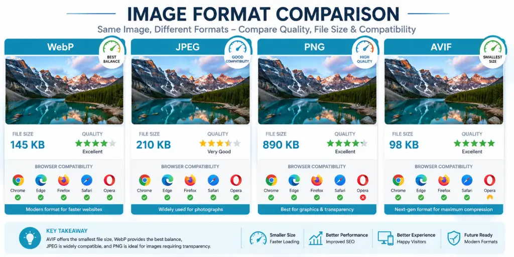
WebP (Best Overall)
Modern format offering superior compression. 25-35% smaller than JPEG at same quality. Supports transparency. Best choice for most website images.
AVIF (Next-Gen)
Even better compression than WebP. 50% smaller than JPEG. Still gaining browser support but worth using with fallbacks.
JPEG/JPG (Photos)
Universal support. Best for photographs and complex images with many colors. Use when WebP isn't an option.
PNG (Transparency)
Lossless compression. Essential for images requiring transparency. Larger files—use only when necessary.
SVG (Logos/Icons)
Vector format—infinitely scalable. Tiny file sizes for simple graphics. Perfect for logos, icons, and illustrations.
GIF (Animations)
Limited to 256 colors. Only use for simple animations. Consider video or APNG for complex animations.
Format Decision Guide
For photographs: Use WebP as your primary format with JPEG as a fallback. WebP gives you significantly smaller files with identical visual quality.
For images with transparency: WebP supports transparency and offers much better compression than PNG. Use WebP with PNG fallback, or just PNG if you need universal support.
For logos and icons: SVG is almost always the best choice. It's resolution-independent, meaning it looks sharp at any size, and the file sizes are incredibly small.
For screenshots: PNG works well for screenshots with text and sharp edges, though WebP is also a good option if you can accept slight quality loss.
If you need to convert between formats, check out tools like Convert Image Format Without Quality Loss to switch formats while maintaining quality.
Best Image Size for Mobile Websites
Here's a hard truth: if you're serving the same massive desktop images to mobile users, you're wasting their data and testing their patience. Mobile optimization isn't optional anymore—it's essential.
The Mobile Reality
Mobile screens are smaller, but that doesn't mean you should just shrink desktop images. Here's what you need to know:
- Typical mobile screen widths: 360-414 pixels for most phones, though some go up to 768 pixels for tablets
- Retina displays: Most modern phones have high-DPI screens, so you need 2× the display size for crisp images
- Data constraints: Mobile users often have limited data plans and slower connections
srcset attribute to serve different image sizes based on the user's screen. This way, mobile users get smaller files while desktop users get larger, sharper images.Responsive Images Explained
Responsive images let you provide multiple versions of the same image, and the browser automatically chooses the best one. Here's how it works:
You upload three versions of your image: one at 600 pixels wide for mobile, one at 1200 pixels for tablets, and one at 1920 pixels for desktop. The browser detects the screen size and downloads only what it needs.
This approach can reduce mobile page weight by 60-80% compared to serving desktop images to everyone. It's one of the most impactful optimizations you can make.
To create different sizes efficiently, use a tool like Resize Image to Exact Size to generate multiple versions quickly. Just upload your master image and create the sizes you need for different breakpoints.
How Image Size Affects Website Speed and SEO
Image optimization isn't just about making your site look good—it directly impacts your search engine rankings and whether visitors stick around or bounce.
Page Speed
Large images are the #1 cause of slow loading pages
Mobile UX
53% of mobile users abandon sites that take over 3 seconds
SEO Rankings
Page speed is a confirmed Google ranking factor
Conversions
1-second delay = 7% reduction in conversions
The Core Web Vitals Connection
Google's Core Web Vitals measure real-world user experience, and images play a huge role in two of the three metrics:
Largest Contentful Paint (LCP): This measures how long it takes for the largest element (usually an image) to load. Google wants this under 2.5 seconds. Optimized images are crucial for hitting this target.
Cumulative Layout Shift (CLS): This measures visual stability. If images don't have specified dimensions, they can cause content to jump around as they load, creating a poor user experience. Always include width and height attributes.
SEO Benefits Beyond Speed
Properly optimized images also help with:
- Image search traffic: Descriptive filenames and alt text help your images appear in Google Image Search
- Accessibility: Alt text helps screen readers describe images to visually impaired users
- Context for search engines: Image optimization signals overall site quality to search engines
The best image size for SEO is the smallest size that still looks professional and serves its purpose. Every kilobyte counts when you're trying to rank well and keep visitors engaged.
How to Resize Images for Your Website Without Losing Quality
Resizing images doesn't have to be complicated. Here's a straightforward process that maintains quality while getting your images to the right dimensions.
Step 1: Determine Target Size
Measure where the image will display on your website. If your content area is 800 pixels wide, that's your target width. Multiply by 2 for retina displays (1600 pixels).
Step 2: Choose Resizing Tool
Use a professional resizing tool that maintains aspect ratio and uses high-quality interpolation algorithms to prevent quality loss.
Step-by-Step Resizing Process
- Start with the highest quality original: Always resize down from a larger image, never up from a smaller one. Upscaling creates pixelation and blur.
- Maintain aspect ratio: Lock the aspect ratio when resizing to prevent distortion. If you need to change the ratio, crop first, then resize.
- Use the right algorithm: Most tools use "bicubic" or "Lanczos" resampling for photos, which produces the best results when shrinking images.
- Resize to exact dimensions: Don't guess—use a tool like Resize Image to Exact Size Online Free to get pixel-perfect dimensions every time.
- Save in the right format: After resizing, save as WebP or JPEG depending on the image type.
For batch processing multiple images, you can use the resize tool repeatedly, or look for batch processing options to speed up your workflow.
How to Compress Images Without Losing Quality
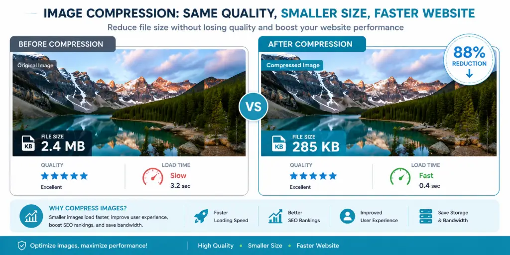
Compression is where the magic happens. You can often reduce file sizes by 50-80% with no visible quality loss. Here's how to do it right.
Understanding Compression Types
Lossy compression: Permanently removes some image data to reduce file size. JPEG and WebP use lossy compression. The key is finding the sweet spot where file size drops significantly but quality remains acceptable.
Lossless compression: Reduces file size without removing any data. PNG uses lossless compression. File size reductions are smaller (typically 20-30%), but quality is perfectly preserved.
Practical Compression Strategy
- Start with proper dimensions: Always resize first, then compress. Compressing a 4000-pixel image when you only need 1200 pixels is wasteful.
- Choose the right quality setting: For JPEG/WebP, 75-85% quality usually provides the best balance. You can often go as low as 70% for complex images without noticeable degradation.
- Use modern compression tools: Tools like Image Compressor use advanced algorithms that preserve quality better than basic compression.
- Test at different levels: Compress the same image at 90%, 80%, and 70% quality. View them side-by-side at actual size to find the lowest quality that still looks good.
- Consider the image type: Photographs can handle more compression than images with text, sharp edges, or fine details.
Ready to Optimize Your Images?
Use our free Image Compressor to reduce file sizes by up to 80% while maintaining visual quality. No registration required, no watermarks, instant results.
Compress Images NowRemember, compression is an iterative process. The best compression settings vary by image, so always check your results before deploying to your website.
Common Website Image Optimization Mistakes
Even experienced website owners make these mistakes. Avoid them to keep your site fast and your images looking great.
❌ Uploading 5 MB Photos
Raw camera files are way too large for web use. Always resize and compress before uploading. A 5 MB photo should be under 300 KB for web use.
❌ Using PNG for Everything
PNG files are huge compared to JPEG or WebP. Only use PNG when you need transparency. For photos, always prefer WebP or JPEG.
❌ Ignoring Mobile Users
Serving desktop-sized images to mobile wastes data and slows loading. Use responsive images or at least serve smaller files to mobile.
❌ Stretching Small Images
Never display an image larger than its actual dimensions. It will look pixelated and unprofessional. Upload images at the size they'll display.
❌ No Compression
Uploading images straight from your camera or design software without compression is a rookie mistake. Always compress before uploading.
❌ Wrong Dimensions
Uploading a 3000-pixel-wide image when it displays at 600 pixels wastes 80% of the file size. Size images for their actual display dimensions.
How to Fix These Mistakes
The good news? All of these mistakes are easy to fix:
- Use Resize Image to Exact Size to get dimensions right
- Use Image Compressor to reduce file sizes
- Convert PNGs to WebP or JPEG using Convert Image Format
- Implement responsive images with srcset attributes
- Always specify width and height attributes to prevent layout shift
Website Image Size Cheat Sheet
Bookmark this section for quick reference. These are proven starting points that work for most websites.
| Image Type | Dimensions | File Size Target | Format |
|---|---|---|---|
| Blog Featured Image | 1200 × 630 px | 150-300 KB | WebP/JPEG |
| Blog Content Image | 1200 px wide | 100-250 KB | WebP/JPEG |
| Hero/Banner | 1920 × 1080 px | 300-500 KB | WebP/JPEG |
| Product Image | 1200 × 1200 px | 150-300 KB | WebP/JPEG |
| Thumbnail | 400 × 300 px | 50-100 KB | WebP/JPEG |
| Logo | 250-400 px wide | <50 KB | SVG/PNG |
| Social Share | 1200 × 630 px | 150-300 KB | WebP/JPEG |
| Background | 1920 × 1080 px | 400-700 KB | WebP/JPEG |
For more specific sizing needs, tools like Custom Shape Crop Tool and Crop Image to Oval Shape can help you create perfectly sized images for unique layouts.
Frequently Asked Questions
The best image size for a website depends on where the image appears. For blog content images, 1200 pixels wide is ideal. For hero banners, use 1920 × 1080 pixels. For thumbnails, 400-600 pixels wide works well. The key is matching the image dimensions to its actual display size on your website, then compressing to keep file sizes under 300 KB for most images.
For standard displays, 72 PPI (pixels per inch) is the traditional web standard. However, with retina and high-DPI displays now common, you should upload images at 2× the display size. So if an image displays at 600 pixels wide, upload it at 1200 pixels wide. The PPI metadata doesn't matter for web—only the actual pixel dimensions count.
Homepage hero images should be 1600-1920 pixels wide and 600-1080 pixels tall, depending on your design. Keep file sizes under 500 KB. For background images that cover the full viewport, 1920 × 1080 pixels is standard. Always compress heavily and use modern formats like WebP to maintain fast loading speeds.
Blog featured images should be 1200 × 630 pixels—this works perfectly for social sharing and looks great on your blog. Images within blog posts should be 1200 pixels wide with flexible height. This width fits most content areas while looking sharp on retina displays. Keep file sizes between 100-250 KB for optimal loading speed.
WordPress themes vary, but generally: featured images should be 1200 × 630 pixels, header images 1920 × 1080 pixels, and content images 1200 pixels wide. WordPress automatically creates multiple sizes, but uploading appropriately sized originals prevents unnecessary file bloat. Use the resize tool before uploading to WordPress.
Aim for under 100 KB for small images like thumbnails, 100-300 KB for standard content images, and 300-500 KB for large hero images. Never exceed 1 MB unless absolutely necessary. Modern compression tools like Image Compressor can reduce most images to these targets without visible quality loss.
Yes, WebP is significantly better than JPG for websites. WebP files are 25-35% smaller than JPEG at equivalent quality, which means faster loading times. WebP also supports transparency (like PNG) and animation. The only downside is slightly less universal browser support, but all modern browsers support WebP. Use WebP with JPEG fallbacks for maximum compatibility.
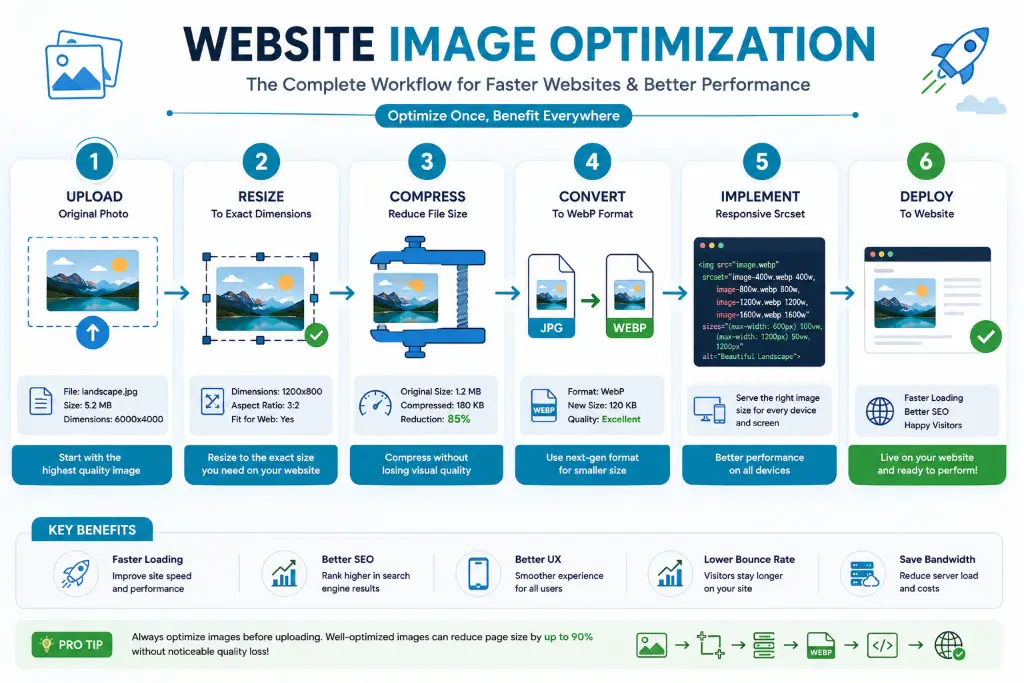
First, resize the image to its exact display dimensions using a tool like Resize Image to Exact Size. Then compress it using smart compression tools like Image Compressor at 75-85% quality. Convert to WebP format for additional savings. This three-step process typically reduces file sizes by 70-90% with no visible quality loss.
Absolutely. Image size directly impacts page loading speed, which is a confirmed Google ranking factor. Large, unoptimized images slow down your site, increase bounce rates, and hurt your Core Web Vitals scores. Properly optimized images improve user experience, reduce page load times, and can boost your search rankings. Additionally, optimized images with proper alt text can rank in Google Image Search, driving extra traffic.
WebP is the best image format for website speed, offering 25-35% better compression than JPEG. AVIF is even better (50% smaller than JPEG) but has less browser support. For photographs, use WebP. For logos and icons, use SVG. For images requiring transparency, use WebP or PNG. Always provide fallback formats for older browsers that don't support modern formats.
Use JPEG (or better yet, WebP) for photographs and complex images with many colors. Use PNG only when you need transparency or for images with text and sharp edges. PNG files are much larger than JPEG—often 5-10× larger for photographs. For most website images, WebP offers the best of both worlds: small file sizes with transparency support.
For mobile, create images at 2× the display width. Most mobile screens are 360-414 pixels wide, so upload images at 720-828 pixels wide for mobile displays. Use responsive images with srcset to serve different sizes to different devices. This ensures mobile users don't download desktop-sized images, saving data and improving load times by 60-80%.
To optimize for Core Web Vitals: 1) Compress images to reduce Largest Contentful Paint (LCP), 2) Specify width and height attributes to prevent Cumulative Layout Shift (CLS), 3) Use modern formats like WebP for faster loading, 4) Implement lazy loading for below-fold images, 5) Use responsive images to serve appropriate sizes. Tools like Image Compressor help achieve these optimizations quickly.
Technically yes, but you shouldn't. Serving desktop-sized images to mobile wastes bandwidth and slows loading. Instead, use responsive images with the srcset attribute to provide multiple sizes. The browser automatically chooses the best size for each device. This can reduce mobile data usage by 70% while maintaining visual quality across all devices.
There's no technical maximum, but for performance reasons, keep individual images under 1 MB, ideally under 500 KB. For standard content images, stay under 300 KB. If an image needs to be larger than 1 MB, consider whether you're using the right format, whether it's properly compressed, or if you can use a different image altogether. Large images hurt loading speed and user experience.
Always resize down from a larger original, never up from a smaller image. Use high-quality resampling algorithms like bicubic or Lanczos. Maintain aspect ratio to prevent distortion. Start with the highest quality source file available. Use professional tools like Resize Image to Exact Size that preserve quality during the resizing process. After resizing, compress carefully to balance quality and file size.
For optimal social media sharing, use 1200 × 630 pixels (1.91:1 aspect ratio). This works perfectly for Facebook, LinkedIn, and Twitter cards. For Instagram, use 1080 × 1080 pixels (square) or 1080 × 1350 pixels (portrait). Always keep file sizes under 300 KB for fast sharing and loading on social platforms.
Always compress images before uploading to your website. Uploading uncompressed images wastes bandwidth during the upload process and gives your website server extra work to do. Pre-compressing also ensures you know exactly what file size you're working with. Use tools like Image Compressor to optimize images locally before uploading them to your CMS or hosting platform.
Final Thoughts: Mastering Website Image Optimization
Getting the best image size for website use isn't about memorizing a single magic number. It's about understanding the principles: match dimensions to display size, compress aggressively, use modern formats, and always consider your mobile users.
Start with these guidelines:
- Resize images to their exact display dimensions using Resize Image to Exact Size Online Free
- Compress every image with Image Compressor before uploading
- Use WebP format whenever possible for 25-35% smaller files
- Implement responsive images for mobile optimization
- Keep file sizes under 300 KB for standard images
- Test your images on actual mobile devices, not just desktop
Ready to Optimize Your Website Images?
Don't let oversized images slow down your website. Use our free tools to resize, compress, and optimize every image for maximum performance and quality.
Start Compressing ImagesRemember, image optimization is an ongoing process. As your website evolves and new formats emerge, stay updated on best practices. Your visitors—and your search rankings—will thank you for the faster, smoother experience.
For more image editing needs, explore our suite of tools including Background Remover, Circle Crop, Professional Image Editor, and many more to perfect every image on your website.